
1
2
3
4
5
6
Aarti Deshmukh
Donor
42/ Female
Aarti is a working professional who supports causes related to animal welfare and education. She prefers making quick, secure donations and staying updated on how her contributions are used.
Pain Points
Lack of trust in how donations are used
Complicated donation processes
Inconsistent updates or communication from NGOs
Rohan Mehta
Volunteer / Student
24/ Male
Rohan is an animal lover and final-year zoology student looking for hands-on experience with shelters and animal care. He values transparency, structure, and flexibility in volunteer opportunities.
Pain Points
Difficulty finding reliable volunteering options
Unclear communication on roles or expectations
Lack of accessible info on programs or onboarding


of users said they were more likely to donate if they understood exactly how their money would be used.
found current NGO websites difficult to navigate, especially on mobile.
expressed a stronger connection to causes that told a personal, emotional story.
Design Objectives
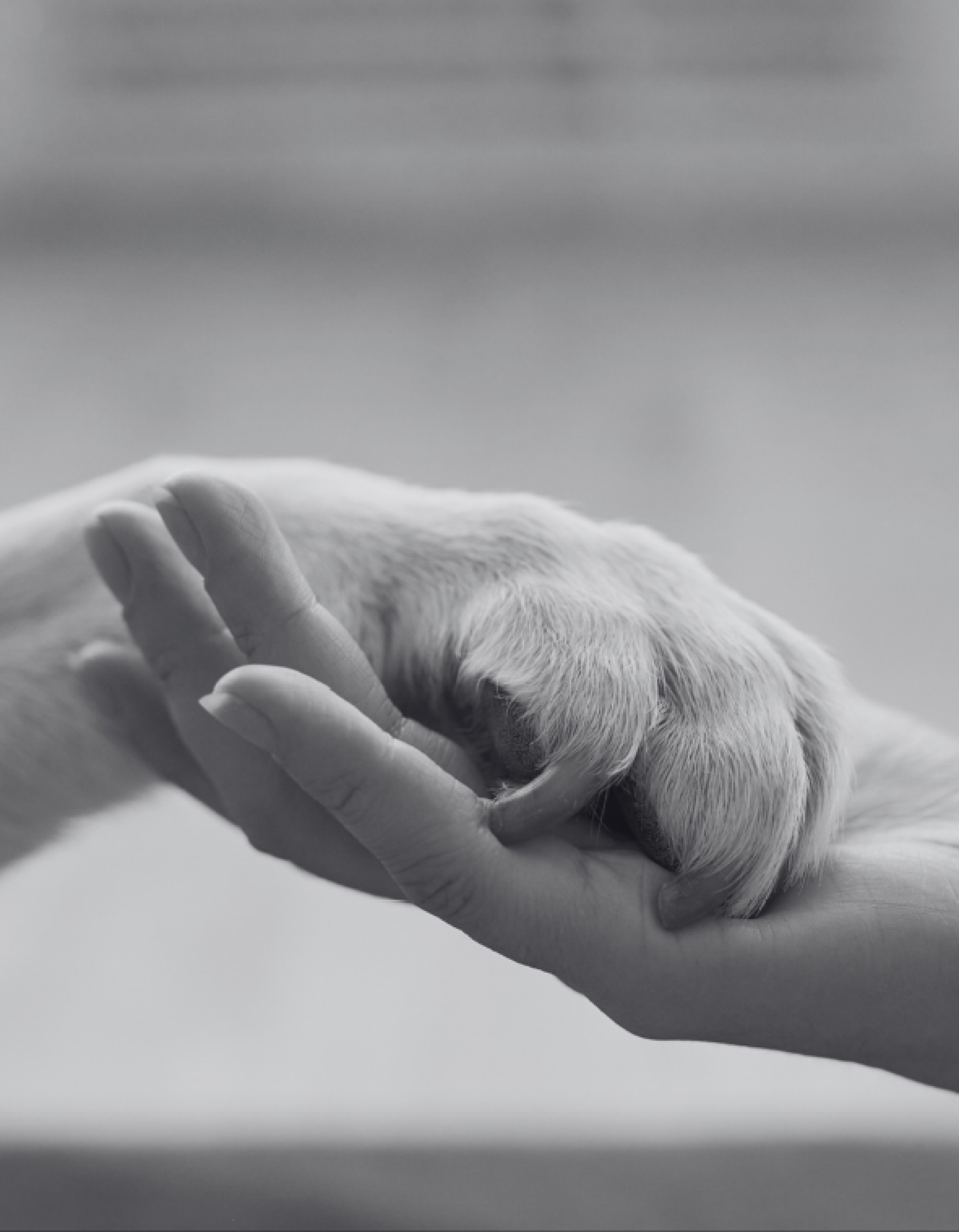
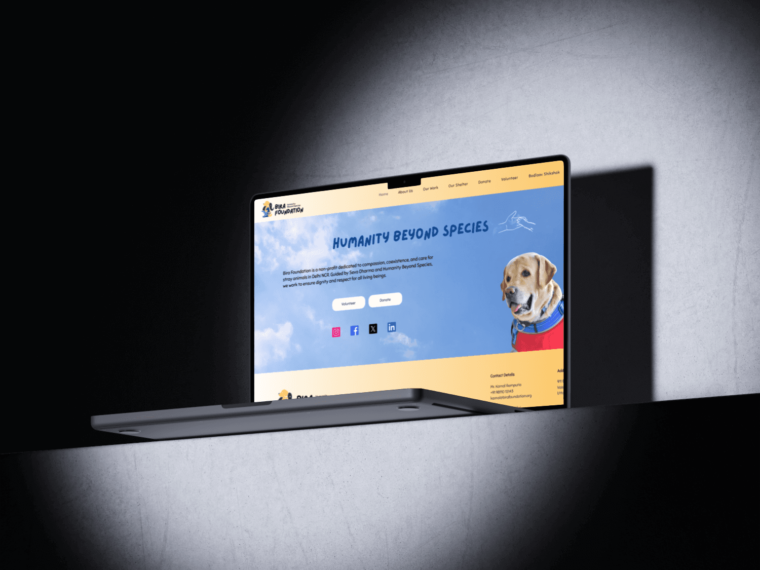
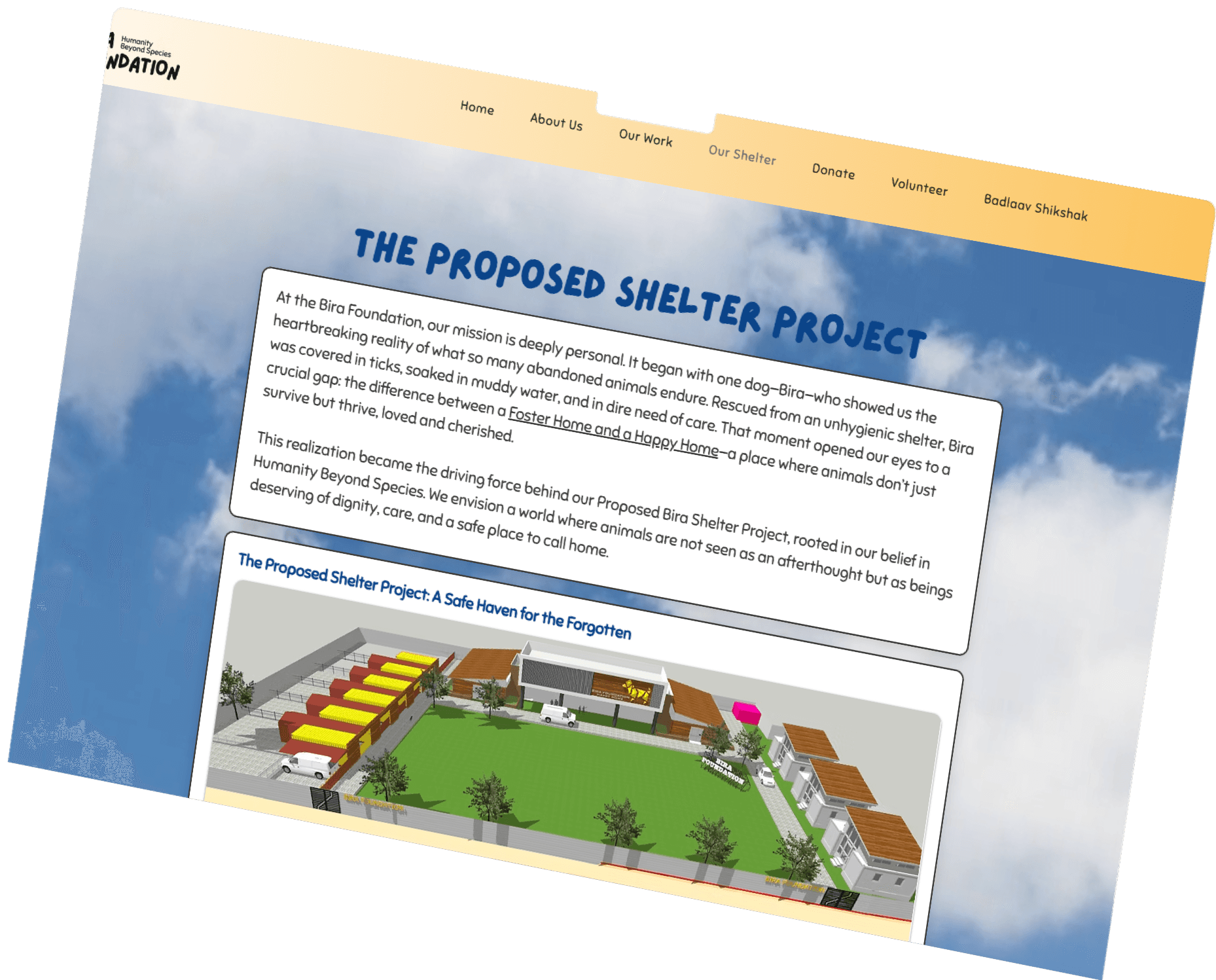
Our goal was to create a visual identity and digital presence that feels warm, trustworthy, and action-oriented. The brand needed to reflect the emotional legacy of Bira while maintaining clarity and professionalism. For the website, we focused on ensuring easy navigation, compelling storytelling, and quick access to key actions like donating, volunteering, or learning about the shelter project. Every design decision aimed to build empathy, encourage support, and reinforce the foundation’s mission of compassion and coexistence.
what outcomes do we want to see?
Key Insights
1
Emotional connection drives action
Users are more likely to support causes that tell a heartfelt, personal story.
2
Trust is essential
Certifications, clear project phases, and founder visibility help build confidence in the organization.
3
Simple journeys encourage support
Users prefer donation and volunteer processes that are quick, clear, and mobile-friendly.
4
Visual clarity matters
Clean layouts, calming colors, and approachable typography improve user engagement and reduce overwhelm.
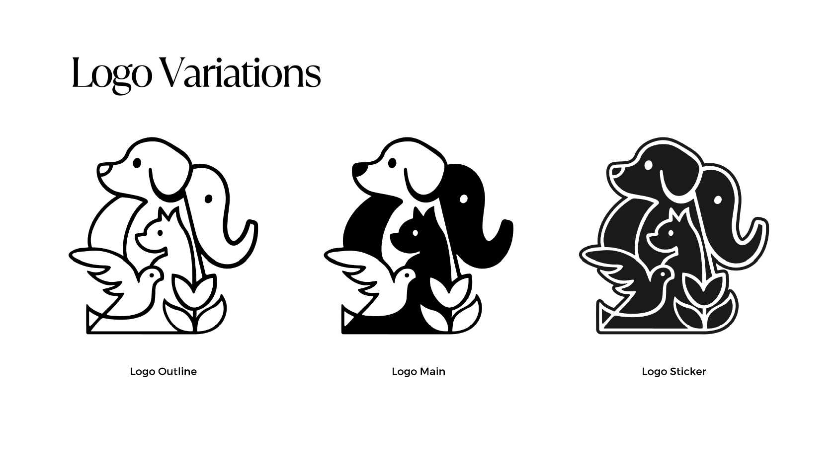
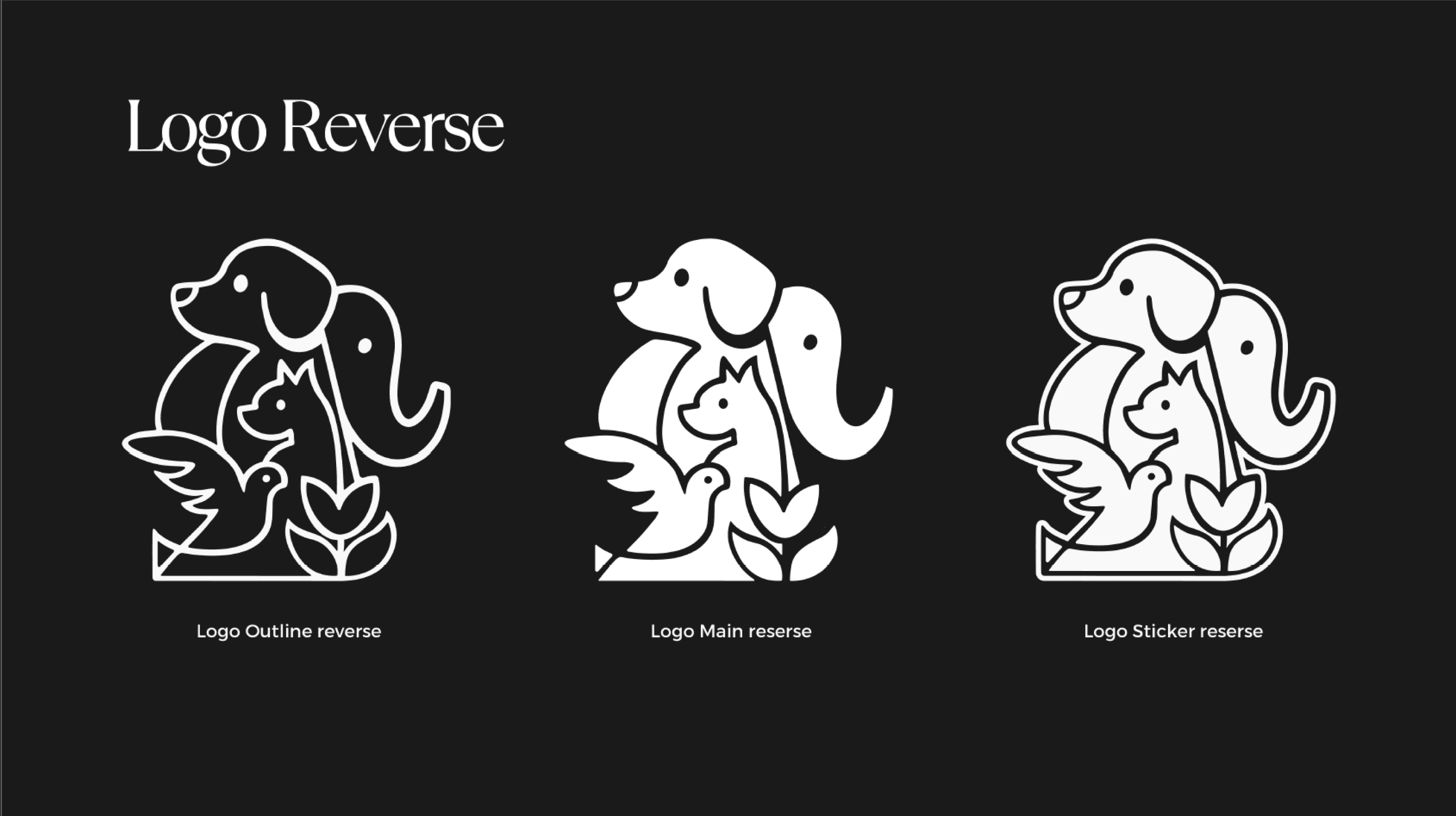
Logo
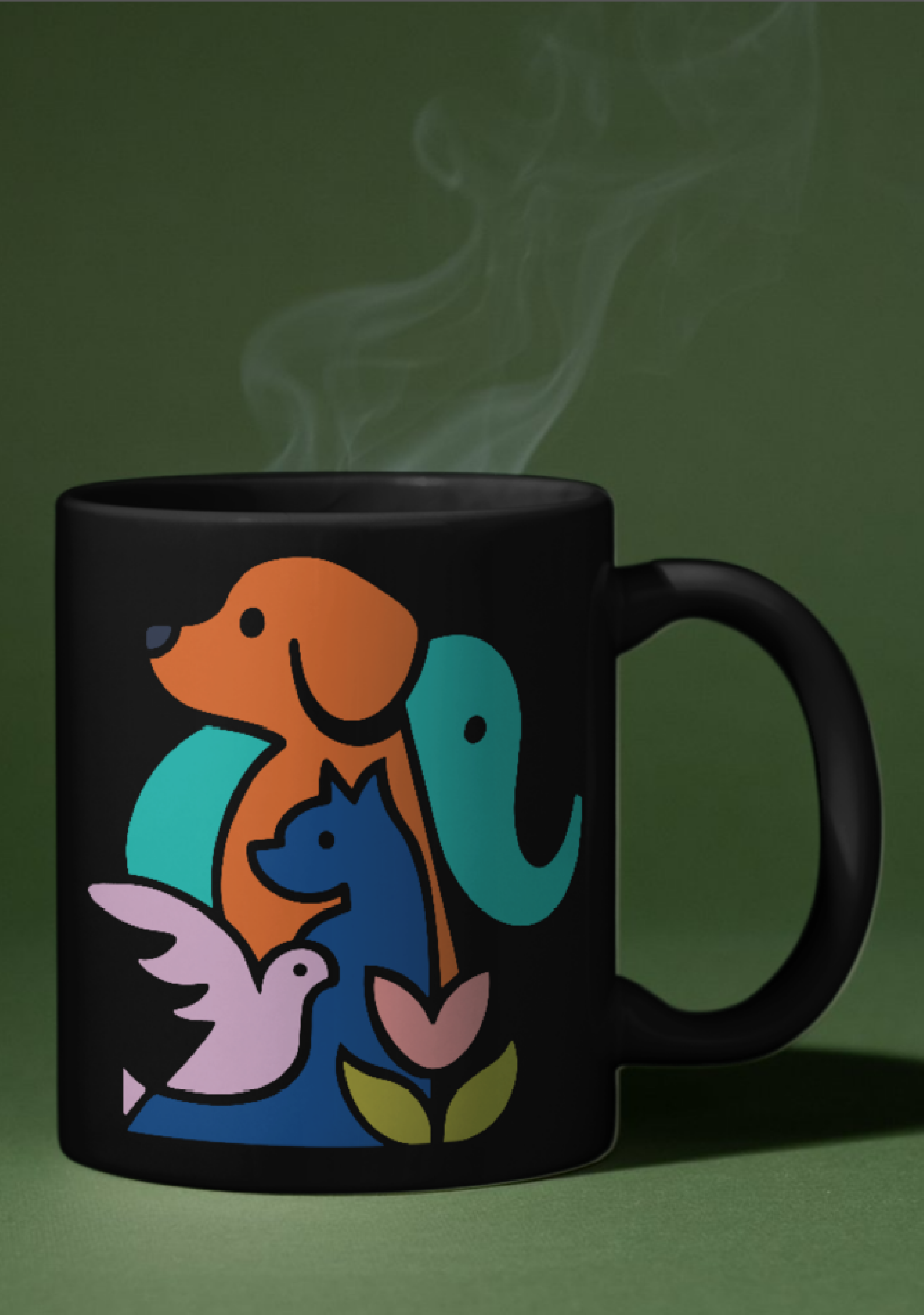
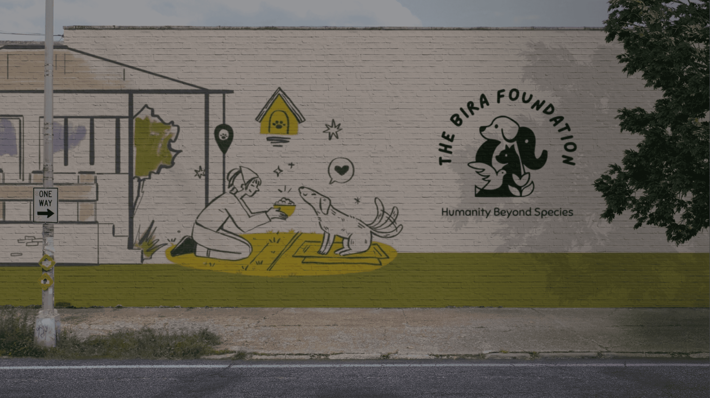
We explored visual elements like paws, hearts, and circles to represent compassion, continuity, and Bira’s legacy. Multiple iterations focused on simplicity, emotional resonance, and versatility. The final logo—a paw with a heart—captures the foundation’s mission of care and coexistence in a clean, memorable form.

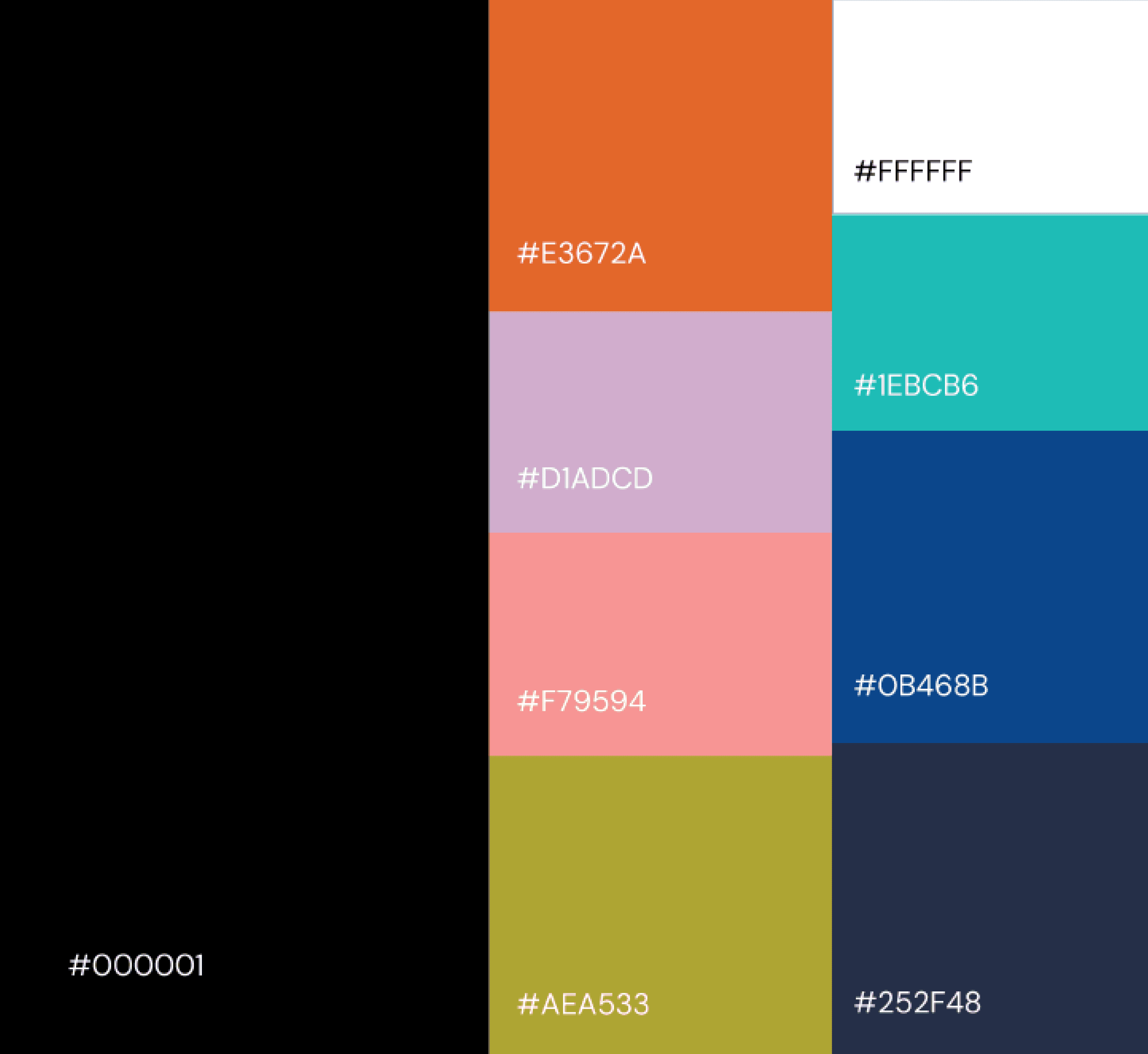
Color Pallete
Typography Hierarchy
We used Lazydog for headings to bring a warm, personal feel that reflects the foundation’s approachable nature. Nunito was chosen for body text for its clean, rounded form, ensuring readability and a friendly tone across all screens.
LazyDog
Aa
Aa Bb Cc Dd Ee
Nunito
Aa
Aa Bb Cc Dd Ee

solutions
What is the Logo ?
The Bira Foundation logo is a visual representation of compassion, care, and emotional legacy. Inspired by Bira—the dog who became the heart of the foundation—the logo combines a paw shape with a subtle heart at its center. This symbolizes the foundation’s mission of love, protection, and coexistence between humans and animals.
Throughout the ideation phase, we explored various forms—from literal paws to abstract symbols—but chose a minimal, rounded mark to convey warmth and approachability. The simplicity of the design ensures flexibility across digital and print media, from website headers to donation badges and merchandise. The logo not only honors Bira’s memory but also builds a strong, trustworthy identity for the foundation moving forward.
Why Choose these colors ?
The color palette was intentionally selected to reflect the emotional values and diverse spirit of the Bira Foundation. Each color represents a unique aspect of the foundation’s mission—vibrant oranges and corals express energy, compassion, and optimism, while calming teals and blues bring a sense of trust, care, and peace. Soft pastels like lavender and pink add emotional warmth, making the brand feel gentle and approachable, especially in spaces where empathy is central.
Earthy greens ground the visual identity in nature, reinforcing the foundation’s connection to all living beings. The balance of vivid and muted tones allows the palette to be expressive and inclusive—just like the animals and humans it represents. Together, these colors create a visual language that is both emotionally resonant and versatile across digital, print, and physical environments.
What Bira Gained ?
The new branding and website helped Bira Foundation establish a clear, emotionally resonant identity that connects with supporters at a deeper level. The logo and visual language built trust and recognition, while the website streamlined key actions like donating, volunteering, and learning about the shelter project. With improved structure, storytelling, and accessibility, the platform now effectively communicates the foundation’s mission, engages new audiences, and encourages ongoing support. It gave Bira’s legacy a powerful digital voice—one that inspires compassion and action.
impact
Stronger Brand Recognition: The new identity made the foundation more memorable and emotionally engaging.
Increased Engagement: Clear storytelling and CTAs improved volunteer sign-ups and visitor time on site.
Simplified Donations: Streamlined donation paths led to more successful contributions.
Improved Credibility: A professional visual presence and clear project phases helped build trust with new supporters.
Better Communication: Visitors now easily understand the mission, vision, and shelter goals through structured content and visuals.
Conclusion
Designing for Bira Foundation was a meaningful experience that reinforced the power of empathy in design. It taught us how deeply personal stories can shape brand identity and how clarity and warmth in communication can build trust. We learned the importance of balancing emotional storytelling with functional design—ensuring that users not only feel connected but are also guided to take action. This project reminded us that good design doesn’t just look good—it makes people care, understand, and contribute.

Visit Bira
Title
Lorem ipsum dolor sit amet, consectetur adipiscing elit. Faucibus in libero risus
01

Let’s Create Something Amazing!
View More